Studio

Himmelblau und Morgenrot by Uschi Jeffcoat

How do you describe the color of the sky?

BD3C4907-F718-4A07-AA00-1FDEAEC7C597.jpg

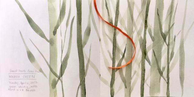
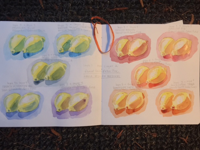
This summer my creative focus has been on color study, observing and learning descriptors, qualities and names. Many of the techniques were based off of a wonderful older book titled Watercolor Technique by watercolorist Rex Brandt. The introduction provided such an accurate and beautiful description of painting in the medium that I knew this was a man to learn from.

Brandt Excerpt.jpg

I ordered a copy of this man’s writings for my personal library simply because of this one quote.

The artist’s feelings and thoughts cannot be readjusted, buried or hidden. (Rex Brandt)

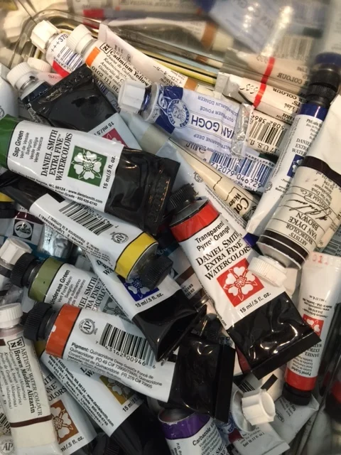
Paper and water carry the painter’s emotion through the tiniest bit of pigment. Yet the choice of pigment matters.

Supplies.jpg

These included studies in color, transparency, layers and value. I played in washes and observations. I visited museums and spent time outdoors soaking in hues throughout the day.

BHaus Museum Color Study.jpg

Versions of color studies can be seen within the newly opened Bauhaus Museum in Weimar. People love a color wheel. My appreciation for color studies began last summer with a visit to the Cooper Hewitt’s exhibition, “Saturation:The Allure of Science and Color”. (Also, reason number 1000 why I believe education should be pursuing STEAM and not STEM programing.)

As Fall approaches, I will be revisiting my summer explorations.

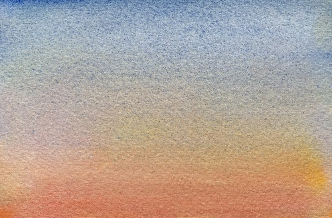
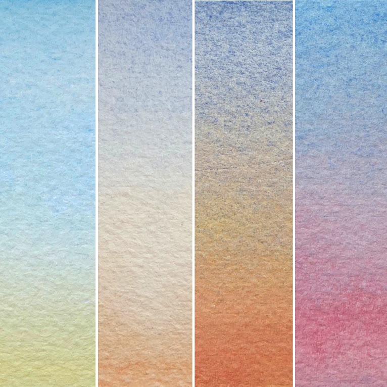
My sky studies were my favorite portion of this summer color study. I’m thinking of sharing these studies through a type of watercolor challenge series on Instagram, because they were so fun.

Which leaves me with how do you describe the color of the sky?

I’m still not sure I can describe the color accurately by pigment color. You?

Morning Sky.jpg
Noon Sky.jpg
Evening Sky.jpg
Industrial Sky.jpg

Defined by Uschi Jeffcoat

I had a conversation yesterday with a friend. She was describing how she is motivated by concepts. Defining things in her life help her,  such as having a word for the year.

And I was thinking, "Huh, wonder what my word for right now is?"

IMG_1264.JPG

It has been a very focused past two months, of work. Both in and out of the studio.

I've been wondering why it's felt so intense and then I recalled what all the "day job" has experienced since January: the snow days, the flu epidemic and then the tragedy in Florida. All those items will shake up the day to day, just a little bit.

And I thought, "Hmm, I could use a good word right about now."

One of the perks of teaching is that you typically work with people who are life long learners and have wonderful knowledge to share.

So on a day, (like today) when you are feeling very bleh, because the pollen is not your friend and you know you need the energy of a Duracell Battery Factory to teach middle school kids in the Spring Time . . . you put on your most comfy flats, roll up the cuffs of the grey wool pants, and put on the softest sweater you own.

And what greets you in your hall?  YOUR word! And I quote . . .

IMG_1380.jpg

"You look so cute and very hygge today!"

hygge ???

(I love working with a good ELA teacher! They are some of the most insightful people I know.)

See the definition below of hygge from the Oxford University Press:

hygge

Pronunciation /ˈhʊɡə//ˈh(j)uːɡə/  noun

A quality of coziness and comfortable conviviality that engenders a feeling of contentment or well-being (regarded as a defining characteristic of Danish culture)

So I am declaring this as the year of hygge for me. In and outside of the studio.

Continued contentment, comfort and enjoyment in what I paint and how I paint. An appreciation for the simple. Thankfulness for work and the ability to do so. And delight in that there is time for the sacred in it all. I'm saying Good-bye to Artist Angst. Hello to hygee.

knew there was a reason why I've been needing and burning through all those Carolina Wren candles! It's all been part of this hygge and the Danish way! :-)


Meet Your Friend, Watercolor Part 1 by Uschi Jeffcoat

Watercolor is a good friend. She is quiet and listens well. Because she demands patience and a gentle touch, she tends to quiet the soul. And she doesn't require much. She is quite happy with a glass of water and a little air. Add a sprinkle of salt and watch magic happen.

Some don't understand her. But they just haven't gotten to know her.

So please, let me introduce you to my friend, Watercolor. You should know that, sometimes she spells her name with a "u"... Watercolour. :-)

All personification aside, (and hopefully you haven't hit unsubscribe because of it) - I am currently teaching a small watercolor intensive to a few friends. While I've taught afterschool art to children, I have never taught watercolor to adults. At one point in college my major was art education, but I realized very quickly that it takes a special kind of bird to teach art.

I tend to loose my words while I am painting, so to do a demonstration and explain what I am doing at the same time is really hard for me. It's as if adding the process of painting into this bilingual brain, jumbles all my words and sends them on vacation. And then some things in the creative process are simply hard for me to explain. 

However, I am enjoying finding those words so that I can share something I love so much with others.

While nothing can compare to active learning in a class setting, if the world of watercolor is of interest to you, I'll be typing a few blogs simply for the sake of sharing more about the medium of watercolor. (And to help me find those art instructional words.)

So here's Part 1.

PAPER & MATERIALS

140lb Kilimanjaro Cold Press Full Sheet

140lb Kilimanjaro Cold Press Full Sheet

On Paper.  The kind you get matters. It's like a PB&J versus steak dinner kinda difference. Full sheets typically require stretching, unless the paper is a heavy weight. Stretching is basically, wetting the paper completely, securing it to a surface and then letting it dry.

Watercolor paper typically comes in the following weights. 90lb, 140lb and 300lb. 90lb is student grade. 140lb is probably the most popular due to quality and price. 300lb is thicker and does not require stretching. It's almost like cardboard. I typically paint on 140lb.

What does weight mean? A manufacturer will weigh a ream of 500 sheets of paper in its uncut state and gives it a number to indicate the paper’s weight. Weight indicates the quality (and usually the price) of the paper.

Texture describes the surface finish on paper. Texture can help define the character of the painting.

Hot press: smooth and slick surface. It doesn’t allow for as soft of color transitions. Good choice for detailed and illustrative work.

Cold press:  What I most use. Water absorbs well and allows for many techniques.

Rough: Bumpier surface than cold press. Good choice for textural surfaces like rocks and such.

WATERCOLOR BLOCKS

A watercolor block is a stack of watercolor paper that is attached together. The sheets of the paper are trimmed to size and then stacked upon each other. That stack of art paper is then attached to a backing board with a padding glue. This glue is applied to all four sides of the paper. These don’t require stretching. You will find an opening at the top of the gummed pages. Peel your completed paper off the stack when you are done.

AQUABORD

This is a fairly new and interesting surface to work on. It allows for the lifting of watercolor and for much more room of error than paper. However, it does not absorb the water and pigment in the same way as paper does. Ampersand makes these.


PAPER BRANDS

Arches Paper has been around since 1492. It is high quality and has an interesting history.

Fabriano is also high quality and lovely paper.

Kilimanjaro paper is another brand with nice quality. You can find it online at places like Cheap Joes.


PAINTS

I now LOVE Daniel Smith watercolor paints! But many other manufacturers make high quality lovely paints. Winsor Newton offers high quality paints and also a few tutorial videos on their sight.

Quality will matter, but I do not recommend that a beginner break the bank on paints.

Colors. You will want a blue, red, yellow, green, probably Raw Sienna and Payne's Grey. But honestly, there are SO many colors to choose from! I prefer to let students experiment with various colors to find those that resonate most with them. My most favorite color is Payne's Grey. Greens can be tricky. I like Sap Green best. A Hansa or Cadmium yellow is good. As far as blues, I like a Winsor Blue with Red Shade and a French Ultramarine. And Daniel Smith Pyrol Orange is a new favorite color.

If you are new to watercolor you will want a palette with a cover if you use tube paints. You simply cover what you haven't painted with and reuse. reuse. reuse. reuse. These paints really go a very long way.

If you'd like to know more, here is a great blog entry about watercolor paints, pigments and why the good stuff costs more.

OTHER SUPPLIES / MATERIALS

Masking fluid, brushes (round and flat), paint pallet, sponge, salt, saran wrap, gauze, gator board, staple gun, painter’s tape, pencil, eraser, tracing paper, paper towels. More about them later.

Giving credit, where credit is due.  My watercolor knowledge came later in life for me. From the kind and thorough instruction of Tom Herzog.

In college, I thought I was too cool for watercolor and only hung out with Oil, Acrylic and Screenprint. I now know who the real cool kids are. I am forever grateful for the opportunity to learn about the medium of watercolor.

Transparent by Uschi Jeffcoat

I live in a culture of good manners and southern charm. And sometimes that takes away the freedom transparency has to offer. I think about this as I compare the unspoken societal rules of respect and polite manners of small southern town living to German frankness and stoic silence - I am acquainted with both.

I believe all these behaviors, I have lived and interacted within desire simply to extend respect and kindness to the other person. Yet, still these ways of communicating intrigue me.

Where is the balance within me?  this person of two cultures? Feeling at home in both but yet, also a stranger at times.

In considering this, I have taken on another 100 day project on Instagram. (not 100% sure I'll finish this one... ) But I am taking time to revisit a few basic watercolor exercises and becoming reacquainted with my palette through play.

I do find the play on words immensely intriguing as I consider the meaning of transparency in relation to these parts of the following definition . . .

Definition of transparent

  1. 1a (1) :  having the property of transmitting light without appreciable scattering so that bodies lying beyond are seen clearly : 

  2. 2a :  free from pretense or deceit :  frank b :  easily detected or seen through :  obvious c :  readily understood

from https://www.merriam-webster.com/dictionary/transparent

Something to think about.

Here are a few images from my first few days as I have explored transparency, layering and how the hues which surround a subject can impact its "personality".

The first being a color study using lemons as the subject matter. 2 layers of hansa yellow medium and then 2 layers of each of the colors explored.

Theses studies are done quickly. Mainly to see and learn what tones and colors are achieved through the layering process.

I don't necessarily like posting such quick, unfinished and messy studies. I would be lying if I didn't acknowledge that my pride feels something should look just so before putting it out there. But I think I am going to try and get past that.

A book I recently read is challenging me in many ways. It references Leonard Cohen's song Anthem:

Forget your perfect offering
There is a crack in everything (there is a crack in everything)
That's how the light gets in

And in order to be transparent, light must get in. Wouldn't you agree?

(The transparent studies in Daniel Smith Sap and Undersea Green are studies in applying pressure to the brush stroke and the impact it has in the width of the line.)

*Ok, so only after day 6, of this project, I realized I would be unable to do the 100 days straight AFTER ALL due to upcoming travel (which may or may not have internet access) and other obligations. So for simplicity's sake, I am continuing on with the exercises as I am able, but not with the Instagram posting for the 100 straight days as I had originally planned* 4/9/17


On #100Days by Uschi Jeffcoat

"Time flies over us, but leaves its shadow behind."  -Nathaniel Hawthorne

I followed the trend. #100dayproject

On Instagram, these people committed to a 100 day project. I felt this would be a brilliant way to commit to practicing art and it would instill good habits. Tiffany Thomas being the most inspiring with all her beautifully captured abstract paintings.

I recently also read that Khaled Hosseini would wake up EARLY in the morning to find the time to write his best selling book, The Kite Runner and still tend to his day job.

That balance to find time for creating (aka sanity) and still tend to the chores of the day is so ... so... desired but yet so difficult to attain. For me there was/is so much to paint and learn! And knowing that time is one of our most valuable assets, I wanted to use and claim it, not squander it.

So I committed to 100 studio mornings.  And it has proven to be so much more than simply time for creating and good habits.

Things I learned these 100 days:

  • posting for 100 days is really difficult - especially as my subject matter began to be paintings that were not for the entire planet to know about -many a random studio object became the center of the post
  • perfection is a time and energy warp and those Instagram editing options and filters fuel the need to capture everything just right. ugh. I gave up on that after a while.
  • I do LOVE a #hashtag. I'm still not sure why and most days I want to #watercolor in every language possible
  • I'm a better artist in the morning than I am late at night. I blame my 40 year old eyes. Hello reading glasses.
  • I wake up easily without an alarm clock because I am waking up to something I enjoy
  • I like and need to be completely ALONE in quiet spaces often-so finding time to paint early in the morning, helps prevent my being a troll the other hours of the day.
  • I have learned why I make art and what it is that I am after in the process
  • I discovered new things to study and explore
  • This quickly became a sacred time for me. Time for praying, meditating, pondering.

All to say, I have loved the process though there were times in the midst of it, that I was ready to be done with it. Mainly because of the posting aspect and not knowing what to put out there.

Here a look back at my first little full of energy and good intention filled post beginning the process. It feels very long ago! Now, I have only two days left. It has increased my productivity, my drawing skills have improved and I've learned a new thing or two about watercolor as well.

A few years ago, I learned to love watercolor from Tom Herzog. He encouraged our class then to commit to painting or drawing each day for at least ten minutes. I get it now, why that is so important and I completely agree.